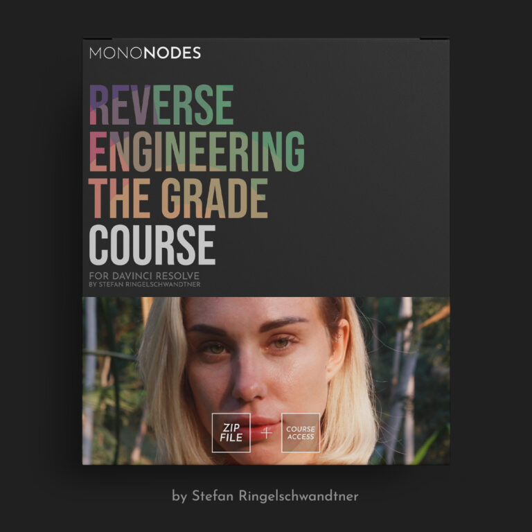
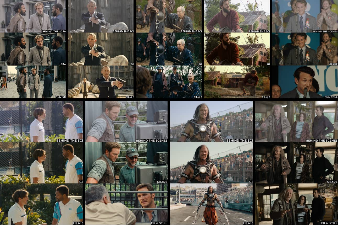
Welcome to my course, where I will guide you through reverse engineering a grade from scratch using behind-the-scenes images.
These images are captured with still cameras, while the films were shot on various cinema cameras, each with its own color science. The goal of this course isn’t to perfectly match a single frame. Instead, we will focus on analyzing the scopes and building a simple node tree to achieve a look similar to the original film.
We will explore the popular “orange and teal” techniques, and I will share my perspective on the most effective and visually pleasing ways to create a complementary color scheme. This includes developing a basic node tree that allows us to replicate the looks of different movies using a minimalist approach.
The objective is not just to imitate, but to examine scopes, deepen your understanding of color harmony, and adopt a straightforward, efficient method. This approach will enable you to work quickly and consistently.
PART 1
In Part 1, I will explore Color Harmony, a foundational element of our course. We will examine various color palettes and how they work together in movie stills, including the popular orange and teal scheme. I will demonstrate four different methods for creating an orange and teal look and delve into why one of these methods stands out as the most effective and flexible. Furthermore, I will share how I design my node tree and provide insights into the look development process.
PART 2
In Part 2, I will focus on “Reverse Engineering the Grade.” Using behind-the-scenes images as the starting point, I will demonstrate the process of creating a grade from scratch. This hands-on demonstration will provide you with a comprehensive understanding of the look development process. By applying the methods introduced in Part 1, you will gain practical skills essential for professional grading.
PART 3
In Part 3, I will discuss how to balance an image using various methods, with a particular emphasis on balancing skin tones to ensure they look natural and consistent. I will explore techniques for maintaining consistency throughout your project, ensuring a uniform appearance across different scenes. Additionally, I will explain the importance of setting the correct middle gray to achieve proper exposure and contrast. In the recap video, all these elements—balance, focus on skin tones, middle gray, and consistency—come together, demonstrating how to create a cohesive look by applying the knowledge from Parts 1 and 2. Furthermore, I will guide you through recreating the distinct cinematic styles of “King Richard” and “Silence,” demonstrating how to apply the techniques learned to achieve specific film looks. This section is designed to deepen your understanding of color harmony and look development, enabling you to produce visually striking and consistent results in your professional projects.


Comments0